
More than 1.5 million units of Persona 5 were sold in worldwide since it was launched in 2016, and it is the best selling release in Atlus History. It has become one of the biggest success of JRPG in recent years, and people speak highly of this 5th game in Persona series.
Persona 5 for me is a story-heavy, turn-based game and the first time that I opened this game on the PS4 with a high expectation given from the internet, I actually was overwhelmed by the cutscenes and dialogues. However, the creative and unique UI design is really something that can catch my eyes at the very beginning and make the game looks vivid with all the words shown on the screen. Players speak very highly of the UI design of Persona 5, and with the wonder of how it looks so good, I have tried to analyze the UI design of this game.
Oblique Angle Shapes
In persona 5, designers use a lot of oblique angle shapes for GUI, creating an irregular sense with a feeling of papercutting. Also, the font on UI is designed to be irregular sizes and in the middle of every title, there is one character with a reverse color square background. Adding this different square into the title strengthens the irregular feeling of whole design.


There is one character with a different background color in every title.
Serve the theme and story
The irregular shapes serve the story and atmosphere well. In Persona 5, all main characters are called “Thief”, who have supernatural power to steal hearts/desires from others. As superpower thieves, they are not normal people, the strong irregular style fits their identity. What’s more, in the past, thieves usually cut newspaper to make a letter without being identified his/her handwriting. In Persona 5, the game characters also cut newspaper out to make “予告状”, which is a notice letter to someone they are going to steal the heart/desire from. The whole UI style is similar to this kind of notice letter. What’s’more, the unstable feeling of shapes and fonts fits the theme of contortion of human nature.

予告状, the notice letter in Persona 5
Important 2D layout
When a lot of oblique angle shapes are used in the game, the layout of UI becomes very important. Persona 5 is a turn-based game, and in every turn during a flight, the players need to choose what they want to do, which means a menu is shown frequently. When we look back at Persona 4, we can find that since the theme is about the television, designers imitated the old TV screen in UI and deliberately added a black frame, and it serves the theme very well. The black frame is helpful for grouping UI elements together. However, the battle menu at the left corner is far away from the character, and the characters statics icons take much space on the right side, which is distracting for players. 
Battle scene in Persona 4
The layout of the menu in the battle scene of Persona 5 is very clever and outstanding. Although the menu design doesn’t show a clear concrete theme, but the colors, fonts, and shapes have a very good thematic cohesion. Every button is designed as a long triangle shape, and all buttons point to the character that is in the turn, which is a clear indication for players. The triangles create a one point perspective on the screen and with a feeling of depth on the UI, the 2D design helps to provide a 3D feeling in the game.

Also, the character is placed on the left, the monster is on the right, which allows players observe the scene without being disturbed by the menu. When more information is shown, such as HP/SP and dialogues, the right side of the screen offers a good balance of the UI.
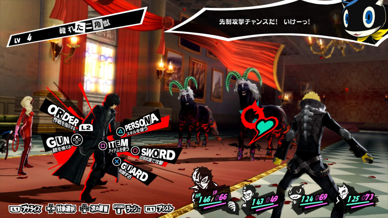
Battle scene in Persona 5
High Contrast Colors
The tone of UI is strong and vivid since designers use high contrast colors on every interface. The theme color of Persona 5 is black and red, and they are used thoroughly in the whole game. We can see black and red colors in all main menus and interface, such as the SNS interface, which is for characters sharing information like people do with a mobile phone.


Menu and SNS screen in Person 5
Thematic Cohesion
Apart from theme colors, purple, green, yellow, red and other high saturation colors are used in other subinterfaces to distinguish the importance of menus but keep the integrity of the whole art style. The careful choices of colors help to create a unique Pop and graffiti style.
The use of oblique angle shapes and high contrast colors helps to create a perfect visual style for nearly all kinds of language, and this is why Persona 5 look almost the same in different kinds of languages. But of course, there is a trick of using English as big titles in all different versions, and as the big part of UI remains the same it is easy to keep cohesion.


The battle scene in English, Japenese and Chinese version of Persona 5
The risk of using high contrast colors in all UI is causing tiredness of eyes after a certain time, and this problem does happen in Persona 5. But luckily, the frequency of using menu is not high in this game, and a lot of transition animations help to amaze players without being upset by the colors.


High contrast colors in all menus
Comic style
Persona series as a JRPG game has a strong comic style for arts and for Persona 5 designers apply the feature of thick borders in comics to the titles and texts. The thick borders not only make texts be easy to read in a certain box but also provide a way to keep content seem comfortable and harmonious in both 3D scenes and 2D scenes.


Classic comics have thick borders surrounding texts


Thick borders surrounding texts are used in 3D and 2D scenes
Transition animations
Indirect control and immersion
Persona 5 uses a lot of detailed animations in the game. Animations are in the transition between two menus, two scenes, and two days. For example in the battle scene, between the change of two camera angles from fighting to the menu, there is a sliding shape on the screen to make a fluent transition. What’s more, it drags the attention from top-right (the enemy position) to left-bottom (the character position) in an indirect way. By using this small animation, the game keeps an immersion in the battle.

Battle scene animation
When the player calls out the menu, an animation of character will appear to bring out the menu. It uses the character’s hand to guide the player’s attention to the menu in the middle.

Calling out menu animation
The transition between days and scenes are creative too. A knife is used to pin to the new day, and the background is the whole city changing from night to morning. In Persona 5, the date becomes important when you have a deadline of your mission, and the player needs to make a good use of every day to figure out how to complete the mission. Therefore, such kind of a long transition animation makes sense for letting players pay attention to the days.

Changing the date animation
The animation happens between scenes changes according to a different scene, such as if a player is going to a subway, then an animation of people standing inside the subway will appear. This kind of loading animation is much better than only blacking out the screen or only a spinning picture appearing. The animation responses to the story and it is simple enough to enhance the atmosphere without adding burden to the game.

Changing the scene animation
Rhythm of motion graphics
With a lot of motion graphics in UI design, it is important to control the rhythm of animation. Take the main menu scene as an example. There are transforming shapes with blue and red color under the chosen button on the menu. Thre are also transforming on the background. Apparently, the stars transform slower than the menu animation. The faster animation on the menu helps to drag attention to the menu but not the background. However, as the background is moving unconsciously, the player gets a feeling of everything is active and things are changing fast. This kind of feeling keeps the player feel the tension and fast paced process in the game, and it can keep the player stay focused on the screen without quitting quickly.
In the battle scenes and recap scenes, the animations keep running fast but detailedly (such as changing numbers and moving texts) and provide a fast speed feeling during the turn-based battles.

Recap (left) animation and battle (right) animation
All these detailed animations in the game make Persona 5 a high quality unique visual piece of JRPG. These motion graphics contribute to the innovation of Persona 5 UI a lot. They not only make the game visually pleasing but also make the experience looks more fluently and immersively.
Inspirations for artistic and thematic UI design
As a story-heavy JRPG game, Persona 5 relies on the story a lot and players spend a lot of time on dealing with dialogues. As a turn-based game, players spend a lot of time on choosing what to do on menus. Therefore, the design of UI strongly affects the experience of the game. Persona 5 bravely chose high contrast color and irregular shapes as the theme and create detailed animations to make the game seem active all the time. Overall this is a successful example of how strong artistic UI helps to smooth and improve the game experience.
For RPG games, most of them try to “hide” the menu and UI as best as they can, so designers don’t put strong artistic elements into the UI. They prefer to make semi-transparent panels for menus and put them at the corners to leave space for the game scenes. Designers tend to keep the UI simple and as less as they can.

UI in Final Fantasy XV (top) and in NieR: Automata (bottom)
For turn-based RPG games, the mechanism determines the game cannot work without many menus. However, normally designers still follow the simple and “less is more” principles. They make semi-transparent colors and rectangle shapes for UIs. In these games, UI doesn’t help to build up the theme a lot, they are only used functionally.


UI in Final Fantasy X (top) and in Disgaea 5 (bottom)
Therefore, when we see the UI in Persona 5, we are amazed by how the UI helps to strengthen the theme and artistic environment a lot. This is a good example of using the UI design to improve game experience in turn-based games. Personally speaking, there are at least 3 things I can learn from Persona 5 for designing artistic and thematic UI for RPG games.
(1) Pick the right colors
Choose 2-3 colors as the themed colors, and consider the contrast of colors carefully according to the story and theme. Stick to the color tone and contrast strictly in every UI, and keep the cohesion even when you use other colors in secondary menus.
(2) Pay more attention to the layout
We don’t need to use a lot of semi-transparent panels in the game if we have a good layout to show the information. In most games, semi-transparent panels are used for reducing the distraction of UI and make the UI fit to the game scenes with any background. However, if you take good use of the screen then you don’t need to make big panels for UI. Such as in the battle scene of Persona 5, designers make the main menu stick to the character as arrows, instead of using a big rectangle panel for placing buttons.
(3) Animations can help a lot.
In Persona5, animations are used for guiding attentions, smoothing the game experience and strengthening the tension of the game. Detailed motion graphics become an essential part of the game.
Of course, UI design for different RPG game can vary a lot. The special comic and dramatic theme of Persona 5 allows it has a stunning and exaggerate UI design. The best UI design for games should be something serve their themes and stories well. Therefore, big panels and semi-transparent colors should not always be the first choice when we design UI for games.

I actually wrote a little bit about Persona 5’s use of UI in my last blog post, but I think one thing that you bring up is the thematic consistency of the UI with the game’s story. The UI text being represented as the “cut-out” letters akin to the calling cards left by the Thieves is a really interesting touch, as it makes the story part of the game feel very consistent with the gameplay. As a result, the whole game feels like a uniform experience, rather than as an amalgam of disparate parts.
LikeLike